Chapter 2 Ionome analysis
2.1 Objective
This chapter has two objectives. Firstly, we try to assign cultivars to groups based on diagnostic leaves ionomes. Although plant health is a continuous domain rather than a categorical status, yield thresholds are useful for decision-making. Because yield potential varies widely among cultivars, we split experimental data into low- and high-productivity categories using a marketable yield delimiter at the 65^th percentile for each cultivar. Hence, we use high yielders subpopulation (samples which marketable yield is larger than the yield cut-off) to look for eventual patterns discriminating groups of similar multivariate compositions (ionomics groups). Then, a principle components analysis is performed. The experimental sites locations are mapped. At the end, the output data file is called dfml_df.csv i.e. the data frame for machine learning chapter (Chapter 3).
2.2 Useful libraries and custom functions
A set of packages is needed for data manipulation and visualization like tidyverse presented in previous chapter (Chapter 1), mvoutlier for multivariate outliers detection, dbscan a density-based clustering algorithm, which can be used to identify clusters of any shape in data set containing noise and outliers, factoextra needed with dbscan for clustering and visualization, vegan to perform principle components analysis, ggmap makes it easy to retrieve raster map tiles from online mapping services like Google Maps and Stamen Maps and plots them using the ggplot2 framework, cowplot can combine multiple ggplot plots to make publication-ready plots, and extrafont allows custom fonts for graphs with ggplot2.
2.3 Leaves processed compositions data set
For this chapter, the initial data set is the outcome of the previous chapter (Chapter 1) leaf_clust_df.csv. Let’s load the data frame.
## Parsed with column specification:
## cols(
##   .default = col_double(),
##   AnalyseFoliaireStade = col_character(),
##   Cultivar = col_character(),
##   Maturity5 = col_character()
## )
## See spec(...) for full column specifications.The experimental sites locations are mapped as follows.
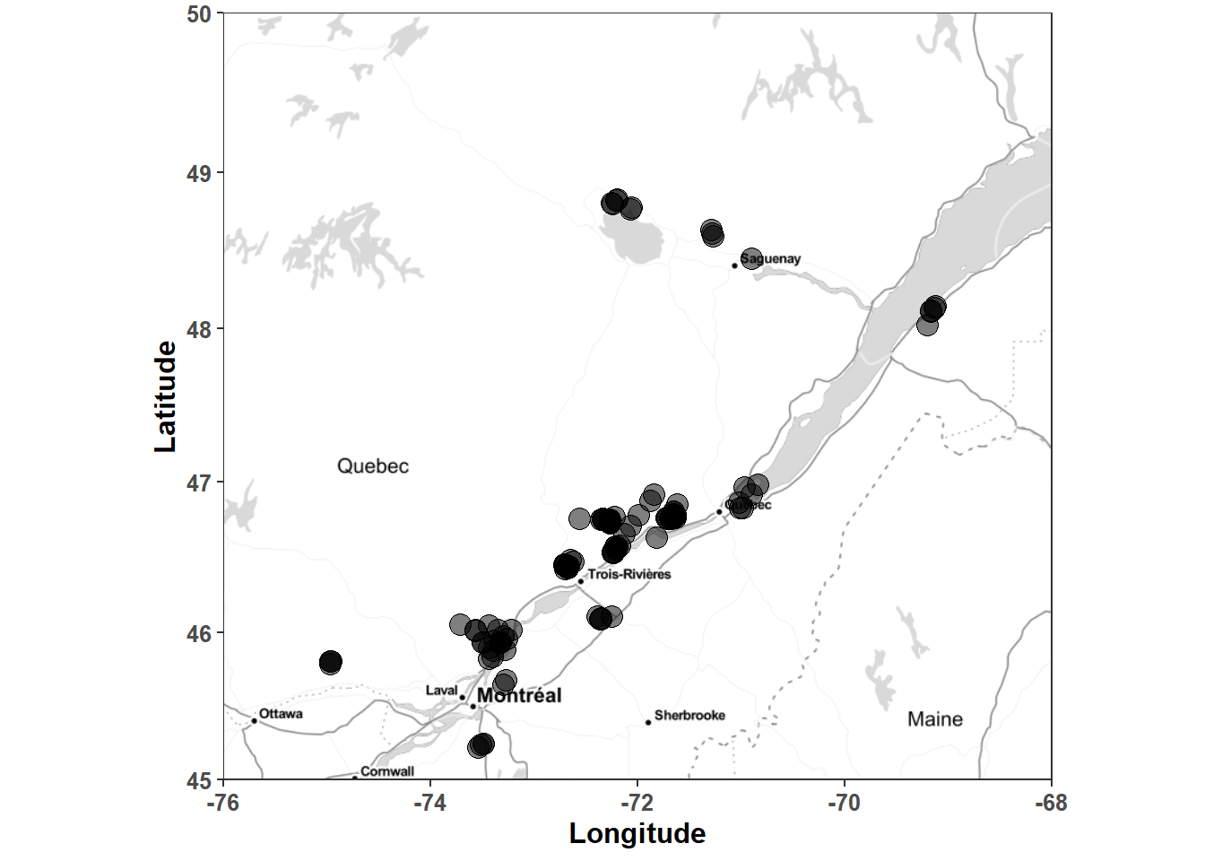
Figure 2.1: Location of experimental sites in the Québec potato data set.
2.4 The yield cut-off, low and high yielders delimiter
For cluster analysis, we keep only high yielders filtered as yield 65% quantile cutter for each cultivar. The cutQ table is used to add the variable yieldClass categorising yield potential to leaf_clust_df. HY and LY stand for high yield and low yield respectively.
cutQ <- leaf_clust_df %>%
  group_by(Cultivar) %>%
  select(RendVendable) %>%
  summarise_if(is.numeric, quantile, probs = 0.65, na.rm = TRUE) #%>%
## Adding missing grouping variables: `Cultivar`leaf_clust_df <- leaf_clust_df %>%
left_join(cutQ, by = "Cultivar") %>%
mutate(yieldClass = forcats::fct_relevel(ifelse(RendVendable >= rv_cut, "HY", "LY"), "LY"))For sake of verification, let’s compute average yield per yieldClass.
mean_yield <- leaf_clust_df %>%
  group_by(yieldClass) %>%
  select(RendVendable) %>%
  summarise_if(is.numeric, mean, na.rm = TRUE)
## Adding missing grouping variables: `yieldClass`## # A tibble: 3 x 2
## yieldClass RendVendable
## <fct> <dbl>
## 1 LY 25.8
## 2 HY 40.5
## 3 <NA> NaNSo, the average marketable yield is 40.48 Mg \(ha^-1\) for high yielders and 24.78 Mg \(ha^-1\) for low yielders. In comparison, average potato tuber yields in 2018 in Canada and in Québec were 31.21 Mg \(ha^-1\) and 28.75 Mg \(ha^-1\) respectively.
2.5 Centered log-ratio (clr) centroids computation
Compositional data transformation is done in the loaded file. We select only clr-transformed variables for high yielders, at 10 % blossom (AnalyseFoliaireStade = 10% fleur) in the next chunk.
hy_df <- leaf_clust_df %>%
  mutate(isNA = apply(select(., starts_with("clr"), Cultivar, Maturity5, RendVendable), 1, anyNA)) %>%
  mutate(is10pcf = AnalyseFoliaireStade == "10% fleur") %>%
  filter(!isNA & is10pcf & yieldClass == "HY" & NoEssai != "2") %>%
  select(NoEssai, NoBloc, NoTraitement, starts_with("clr"), Cultivar, Maturity5, RendVendable) %>%
  droplevels()
1334 lines of observations (samples) will be used to find patterns in potato cultivars. The next chunks check the number of samples per cultivar in this high yielders data set. Some cultivars have been discarded from the table after the previous filter.
percentage <- round(with(hy_df, prop.table(table(Cultivar)) * 100), 2)
distribution <- with(hy_df, cbind(numHY = table(Cultivar), percentage = percentage))
distribution <- data.frame(cbind(distribution, rownames(distribution)))
colnames(distribution)[3] <- "Cultivar"
distribution$numHY <- as.numeric(as.character(distribution$numHY)) # numHY is the number of samples
distribution$percentage <- as.numeric(as.character(distribution$percentage))
distribution <- distribution %>%
  arrange(desc(numHY)) # arrange in descending order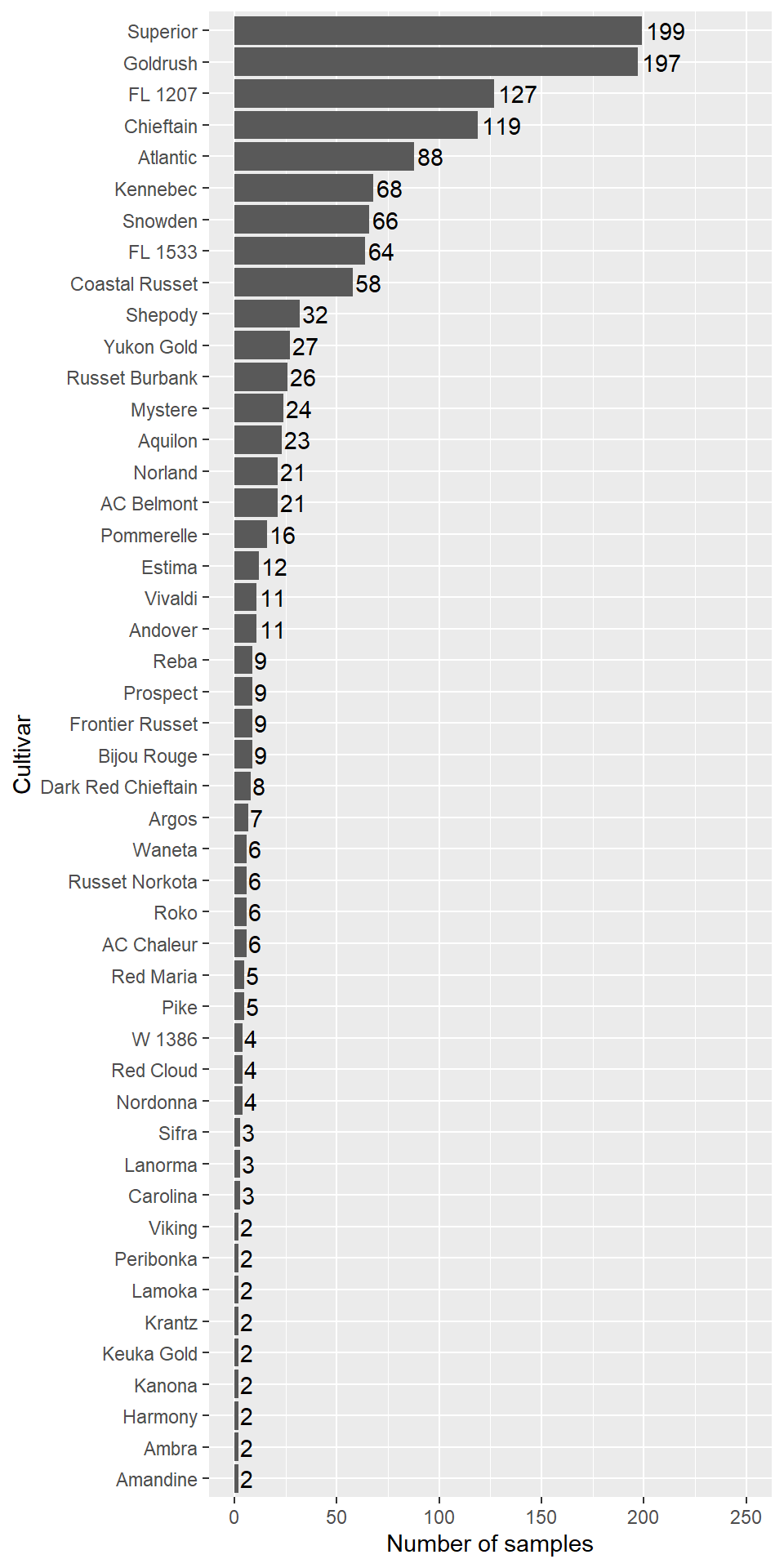
Figure 2.2: High yielders cultivars abundance.
Some cultivars are well represented, like Superior and Goldrush. Let’s compute number of cultivars and trials in the data frame.
data.frame(numb_cultivars = n_distinct(hy_df$Cultivar, na.rm = TRUE),
           numb_trials = n_distinct(hy_df$NoEssai, na.rm = TRUE))
## numb_cultivars numb_trials
## 1 47 151The next chunk creates a table with cultivars, maturity classes and median clr values i.e. clr centroids for cultivars (the S2 Table of the article).
hy_clr <- hy_df %>%
  group_by(Cultivar, Maturity5) %>%
  select(Cultivar, Maturity5, starts_with("clr")) %>%
  summarise_all(list(median))
hy_clr
## # A tibble: 47 x 8
## # Groups: Cultivar [47]
## Cultivar Maturity5 clr_N clr_P clr_K clr_Ca clr_Mg clr_Fv
## <chr> <chr> <dbl> <dbl> <dbl> <dbl> <dbl> <dbl>
## 1 AC Belmont early 0.701 -2.02 0.664 -1.11 -1.64 3.47
## 2 AC Chaleur early 0.696 -1.97 0.349 -1.04 -1.54 3.51
## 3 Amandine mid-season 0.519 -2.29 0.557 -0.696 -1.62 3.53
## 4 Ambra mid-season 0.713 -1.98 0.275 -1.08 -1.39 3.46
## 5 Andover early mid-season 0.872 -2.17 0.738 -0.808 -2.28 3.57
## 6 Aquilon mid-season 0.783 -1.86 0.387 -0.901 -1.83 3.48
## 7 Argos late 0.767 -1.77 0.570 -1.28 -1.70 3.43
## 8 Atlantic mid-season 0.784 -1.87 0.155 -1.09 -1.50 3.56
## 9 Bijou Rouge early 0.942 -1.93 0.563 -1.12 -1.93 3.61
## 10 Carolina early 0.598 -2.19 0.131 -0.837 -1.34 3.63
## # ... with 37 more rowsMultivariate outliers detection technique is used to identify outliers with a quantitle critical value of qcrit = 0.975 by cultivar only if cultivars contain at leat 20 rows. If less than 20 rows, all rows are kept. The new data frame hy_df_in will be used for patterns recognition and discriminant analysis.
hy_df_IO <- hy_df %>%
  group_by(Cultivar) %>%
  select(starts_with("clr")) %>%
  do({
    if (nrow(.) < 20) {
      IO = rep(1, nrow(.))
    } else {
      IO = sign1(.[,-1], qcrit=0.975)$wfinal01
    }
    cbind(.,IO)
  }) %>%
  ungroup()

hy_df_in <- hy_df_IO %>%
  filter(IO == 1) %>%
  select(-IO) %>%
  droplevels()
144 outliers have been discarded.
2.6 Clustering potato cultivars with leaf ionome
Patterns recognition is done with dbscan algorithm which can identify dense regions measured by the number of objects close to a given point. As explained by the author, the key idea is that for each point of a cluster, the neighborhood of a given radius has to contain at least a minimum number of points.
We use the high yielders clr centroids of cultivars in a new data frame which is the same as hy_df_in without maturity classes.
hy_centroids <- hy_df_in %>%
  group_by(Cultivar) %>%
  select(starts_with("clr")) %>%
  summarise_all(list(median)) %>%
  ungroup()
## Adding missing grouping variables: `Cultivar`Two important parameters are required for dbscan: epsilon (“eps”) and minimum points (“MinPts”). The parameter eps defines the radius of neighborhood around a point x. It’s called the \(\epsilon\)-neighborhood of x. The parameter MinPts is the minimum number of neighbors within “eps” radius. The optimal value of “eps” parameter can be determined as follow:
set.seed(5773)
hy_centroids %>%
  select(starts_with("clr")) %>%
  as.matrix() %>%
  kNNdistplot(., k = 5)
abline(h = 0.3, lty = 2)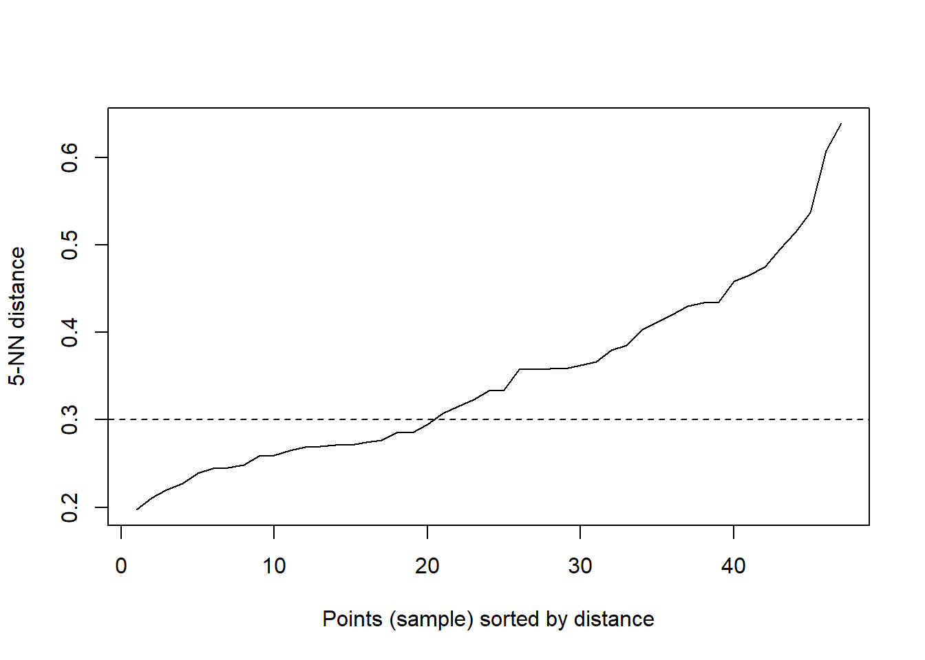
Figure 2.3: The optimal value of “eps” parameter.
The chunk below makes the prdiction of clusters delineated by the dbscan algorithm. Zeros are not a cluster or designates the cluster of outliers.
res <- hy_centroids %>%
  select(starts_with("clr")) %>%
  as.matrix() %>%
  dbscan(., eps = .3, minPts = 5)
predict(res)
## [1] 0 1 0 1 0 1 0 1 1 1 1 1 1 1 1 1 0 1 1 1 1 0 0 0 0 1 1 0 1 1 1 1 1 0 1
## [36] 0 1 1 1 0 1 1 1 0 1 1 1This result can also be visualized graphically:
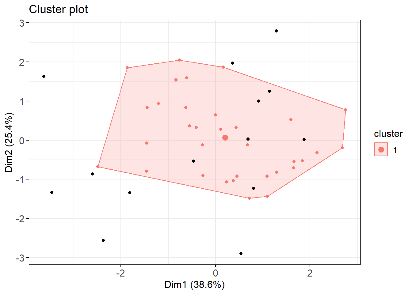
Figure 2.4: Cluster plot of poato cultivars based on centered log-ratio N P K Mg Ca transformed compositions of diagnostic leaves.
Black points are outliers (zeros). As shown on the plot, one cluster means there is no detectable shape between cultivars ionomes as dots are scattered differently. It may not be useful to think of possible structures between potato cultivars based on ionome. Nethertheless, one could extract scores of the first two discriminant axes and loadings of clr variables to check for correlations and elements that best discriminate axes.
2.7 Axis reduction
Leaves composition data are compositionnal data (non-negative and summing to unity) so are multivariate. It’s not possible to draw such a diagram on paper with more than two or eventually three dimensions, however, even though it is a perfectly valid mathematical construct Legendre et Legendre, 2012. For the purpose of analysis, we project the multidimensional scatter diagram onto bivariate graph. The axes of this graph are chosen to represent a large fraction of the variability of the multidimensional N-P-K-Mg-Ca-Fv data matrix, in a space with reduced i.e. lower dimensionality relative to the original data set. The next chunks perform a Principle Component Analysis (PCA) to check biplots, using vegan::rda() function.
The rda result object stores samples scores in the sites table and variables loadings in species data table.
scores_df <- data.frame(scores(leaf.pca, choices = c(1,2))$sites)
loadings_df <- data.frame(scores(leaf.pca, choices = c(1,2))$species)
The biplot of PCA is presented in separate plots for easy reading.
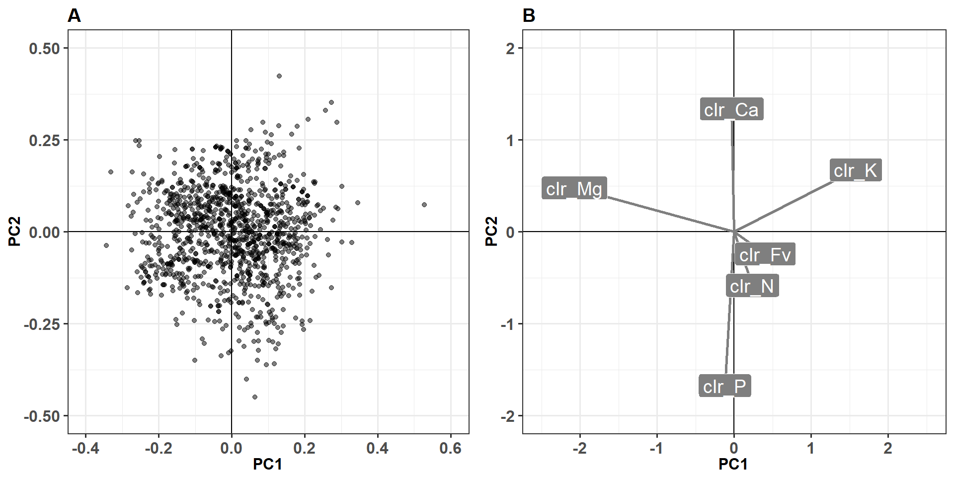
Figure 2.5: Grid plot of potato ionome principle component analysis.
The first principle axis or component (PC1) is formed mainly by Mg and K while the second (PC2) is driven mainly by P and Ca.
2.8 Do clrs affect potato tuber yield?
We will measure the clrs effect on tuber yield by measuring their importance in machine learning models using varImp() method of random forest algorithm, in the next chapter (Chapter 3).
Let’s select useful columns in a new table named dfml.csv and filter only complete cases with the following chunks.
rdt_max <- rep(NA, nrow(leaf_clust_df)) # max yield per trial (empty vector)

for (i in 1:nlevels(factor(leaf_clust_df$NoEssai))) {
  filtre <- leaf_clust_df$NoEssai == levels(factor(leaf_clust_df$NoEssai))[i] # filter for test i
  rdt_max[filtre] <- ifelse(is.na(leaf_clust_df$RendVendable[filtre]), NA,
                            max(leaf_clust_df$RendVendable[filtre], na.rm = TRUE))
}
rdt_max[!is.finite(rdt_max)] <- NA
leaf_clust_df$RendVendableMaxParEssai <- rdt_max
dfml <- leaf_clust_df %>%
select(NoEssai, NoBloc, NoTraitement,
starts_with("clr"),
RendVendable, rv_cut, yieldClass,
AnalyseFoliaireStade, Maturity5,
# RendVendableMaxParEssai,
Cultivar) %>%
mutate(isNA = apply(select(., starts_with("clr"),
Cultivar, Maturity5, RendVendable), 1, anyNA)) %>% #Maturity5,
mutate(is10pcf = AnalyseFoliaireStade == "10% fleur") %>%
filter(!isNA & is10pcf & NoEssai != "2") %>%
# filter(RendVendableMaxParEssai >= 28) %>%
select(-c(AnalyseFoliaireStade, isNA, is10pcf)) %>% #, RendVendableMaxParEssai)) %>%
droplevels() %>%
filter(complete.cases(.))
write_csv(dfml, "output/dfml.csv")So, the Machine learning data table contains 3382 samples. Finally, let’s check cultivars abundance in the data frame. Cultivar Goldrush overcomes the others.
pc <- round(with(dfml, prop.table(table(Cultivar)) * 100), 2)
dist <- with(dfml, cbind(freq = table(Cultivar), percentage = pc))
dist <- data.frame(cbind(dist, rownames(dist)))
colnames(dist)[3] <- "Cultivar"
dist$freq <- as.numeric(as.character(dist$freq))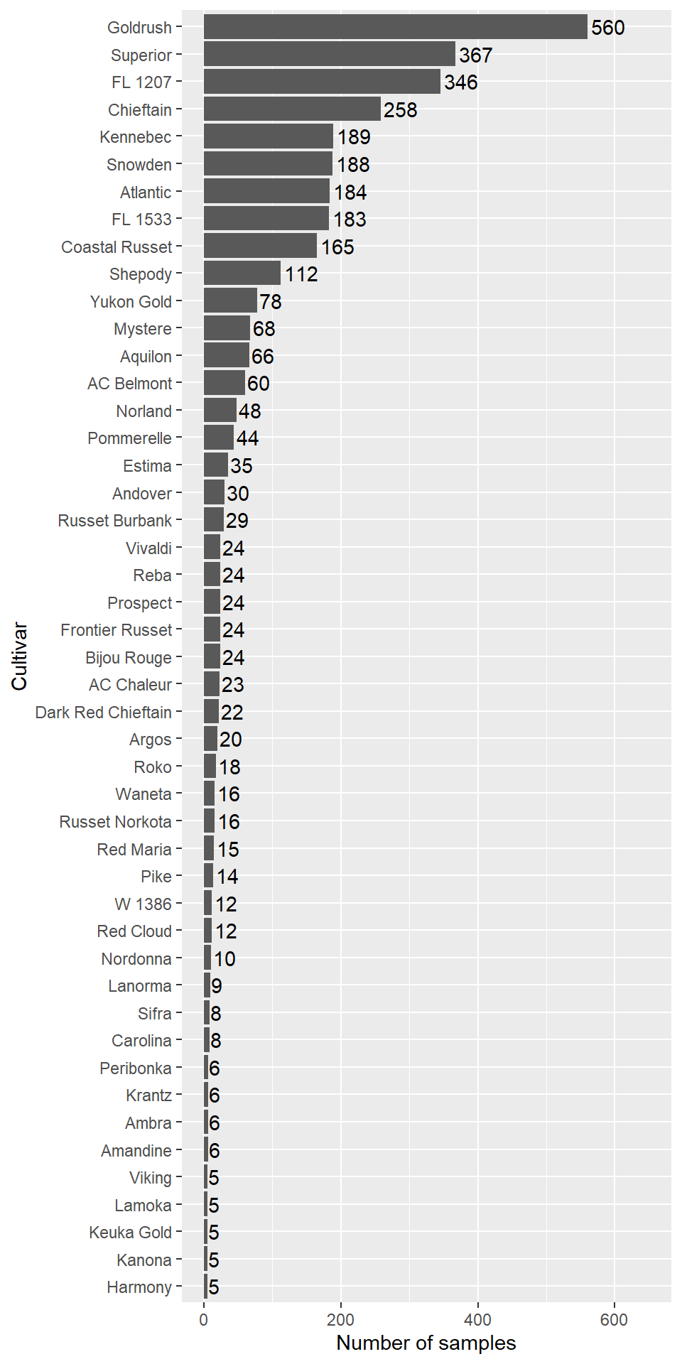
Figure 2.6: Cultivars abundance in the machine learning data frame.
The following chuk draws the S2 table of the manuscript.
yield_cutoff <- cutQ %>% filter(Cultivar %in% distribution$Cultivar)
s2table <- hy_clr %>% select(Cultivar, Maturity5) %>%
  left_join(distribution, by = "Cultivar") %>%
  left_join(yield_cutoff, by = "Cultivar") %>%
  left_join(hy_centroids, by = "Cultivar") %>%
  left_join(dist, by = "Cultivar") %>%
  select(Cultivar, Maturity5, numHY, freq, rv_cut, starts_with('clr'))
## Warning: Column `Cultivar` joining character vector and factor, coercing
## into character vector
## Warning: Column `Cultivar` joining character vector and factor, coercing
## into character vector